Case Study: Designer’s Studio Catalog
Project Overview:
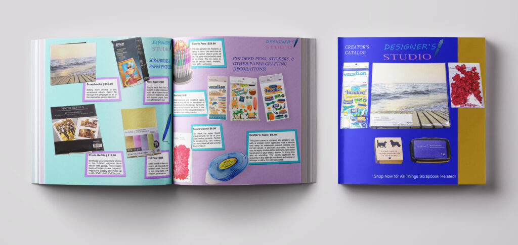
Primo Creatives was asked to design a catalog for a fictional art supply store called Designer’s Studio. This was the company’s first catalog design and one of our first big projects. We designed the front cover, along with two interior pages. All of those product photos were taken by our photography team specifically for the catalog. We designed the entire catalog in Adobe Photoshop and we also designed their company logo in Adobe Illustrator. The picture above is a mockup put together by the founder and art director, Laken Messier containing the front cover and both interior pages.
Front Cover:
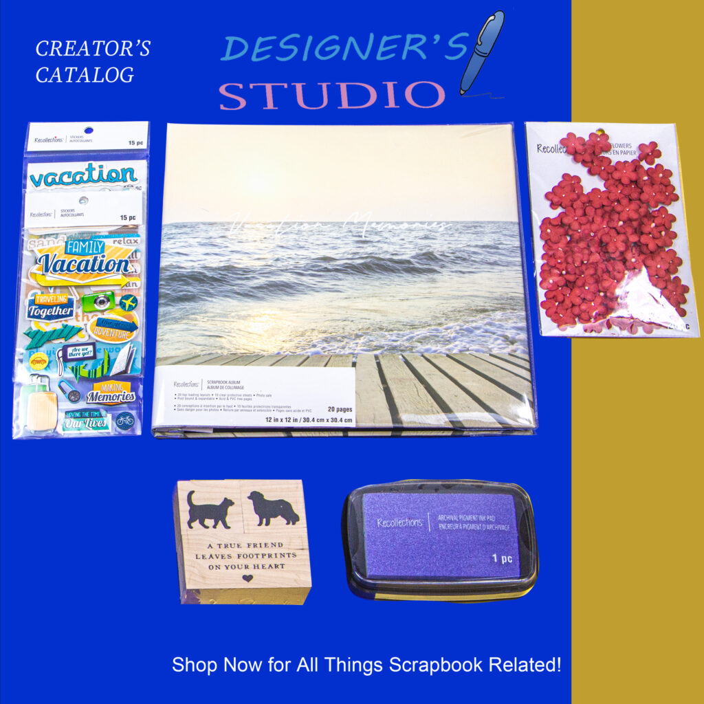
For the front cover, the photography team at Primo Creatives photographed the top selling products at Designer’s Studio. We made sure to center the most important product, the scrapbook and choose other smaller products to be positioned around it. We chose a blue and gold background as our team thought it would collaborate nicely with the products. We wanted to make sure their logo was nice and centered on top of the page with a call to action at the bottom, “Shop Now for All Things Scrapbook Related!” We also categorized our catalog as “Creator’s Catalog” up in the top left corner. Our graphic design team did our best to make sure this cover would catch the eyes of any creative designers.
First Interior Page:
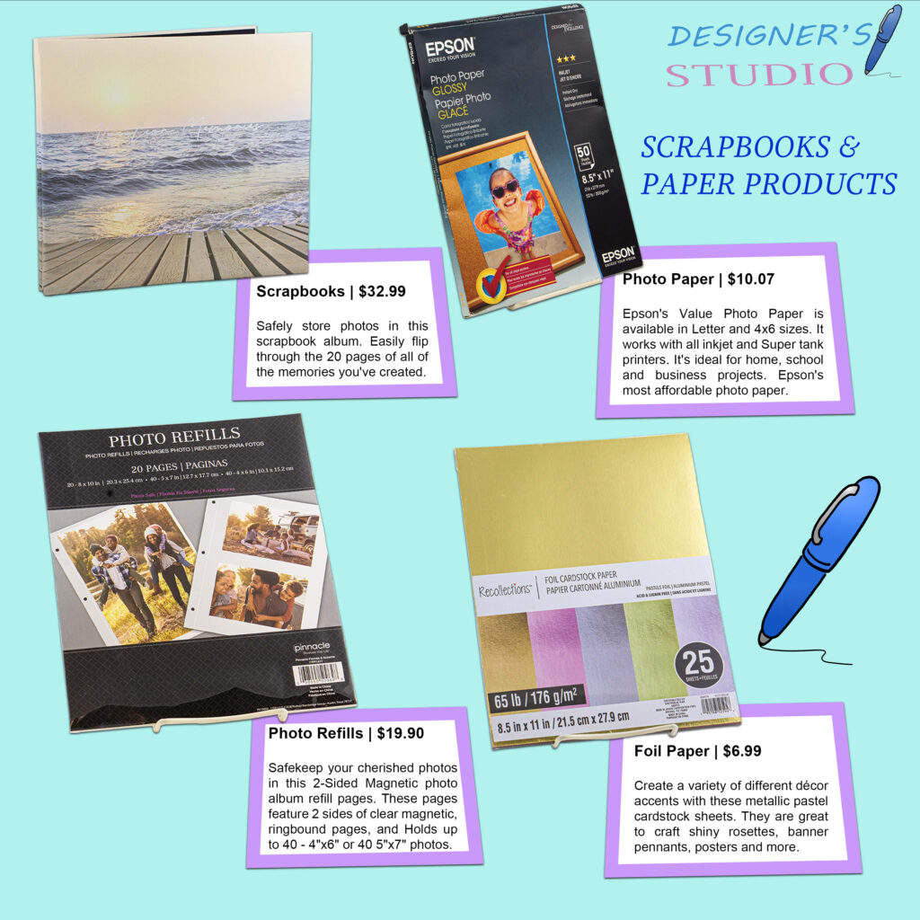
For the first inside page, we showcase Designer’s Studio’s paper products such as scrapbooks, foil paper, and photo refills. We designed little book icons to advertise their prices and a brief description on each of the items sold. All of those descriptions were typed up by art director, Laken Messier. The photography and Photoshop work was also done by Laken, as well as the layout design overall. The goal was to make each page feel fun and crafty, as that is how the store wanted to be represented. The color choice for the background is a teal we found speaks to Designer’s Studio’s brand identity very well.
Second Interior Page:
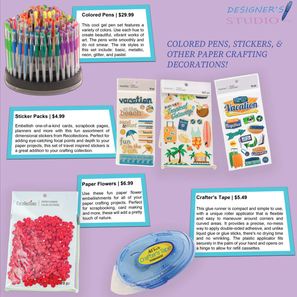
For the design of the second interior page, Primo Creatives showcased the fun add-on products such as colored pens, decorative flower petals, and stickers. The products and text icons are arranged in a Z pattern that our designers found to be decorative to the company. The photos alternate from left to right in each row. Our team decided to save these fun products for the last page as we wanted Designer’s Studio’s audience to have a memorable takeaway after viewing this catalog. Art director and founder, Laken Messier photographed these products and edited them in Adobe Photoshop for the catalog. The purple background was taken into consideration from the brand logo, as it is a similar color and represents the brand well.
What is my Takeaway or Inspiration for this Project?
Overall, designing Designer’s Studio’s catalog was a very valuable project to our company and our team worked really hard on this project. We took our inspiration from other art catalogs, as we wanted to follow the trends, but stand out on our own most importantly. The problem we faced was seeing Designer’s Studio without a catalog to advertise their starting business. It was our mission to solve the problem by spending weeks making sure Primo Creatives delivered them the best catalog on the shelves! We really enjoyed working on this catalog and we look forward to our next catalog design!