Rock Band Logo
Primo Creatives was asked to design a logo for The Converters rock band. Our task was to create a unique logo that appealed to the biker crowd and hard rock. So, our team did some research on The Converters as we began our design process. We began with some prototypes for different logo options, then worked our way to choosing our favorite, and we even included mockups. Continue reading for our full experience designing The Converters logo.
Rock & Roll Logos:
The first step after conducting research is sketching out different logo ideas. Our ideas ranged from bikes to electrifying guitars. We have six different variations here and we saw many positive aspects in all of them. Out of the six, we were going to choose one and that would be the logo we work with.
With the help of expert opinions, Primo Creatives chose to polish this logo and prepare it for submission. We felt the elements within this logo really spoke to the band and their audience. With some minor improvements, our logo will be good to go.
A Polished Take:
Here is our final logo, fully colored and ready to go! We chose those colors because they are the first colors that pop into our heads when we think about rock n’ roll bands. We feel these colors will definitely reach the likes of Converters fans and they will serve as great representation for The Converters band overall. As we tried to keep our polished logo similar to our initial sketch, we’ve made some improvements to create a better connection between elements and to help the logo feel more electrifying. Therefore, we decided to make the skull the focused element with roses for the eyes and guitars as crossed bones. The font we used is BN Elements from Adobe Fonts. It is a font we found suited the Converter theme very well.
Mockups:
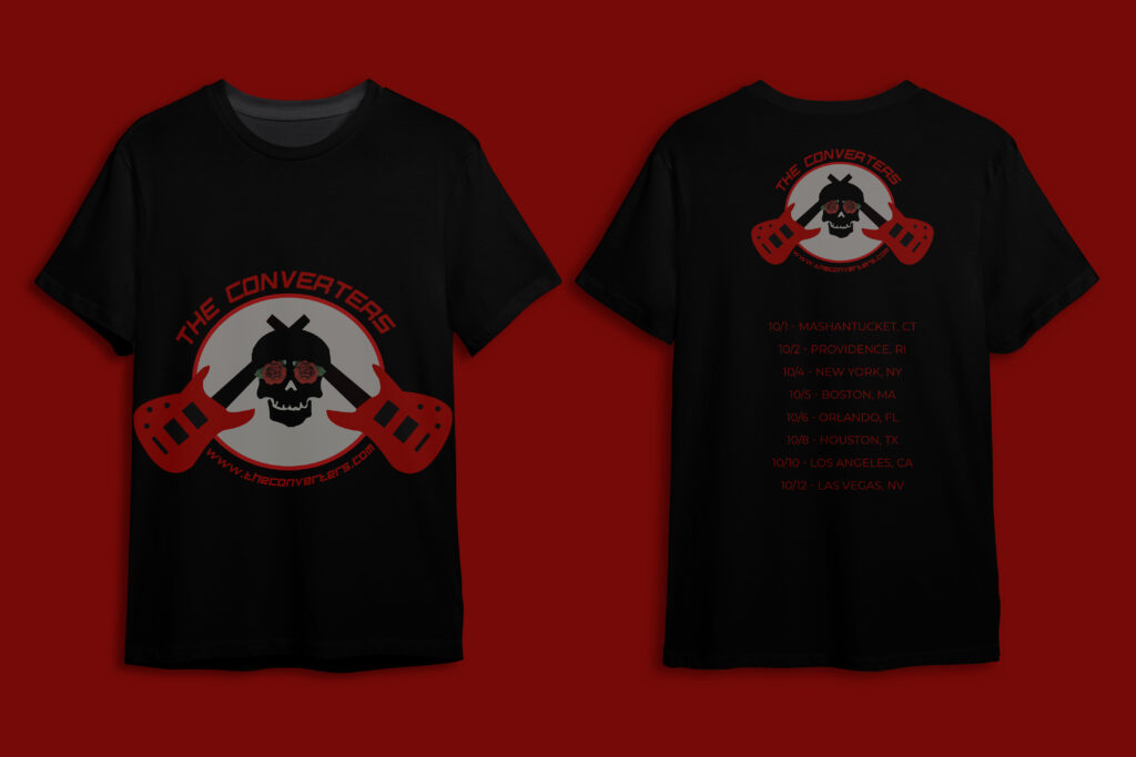
Tour T-Shirt Prototype
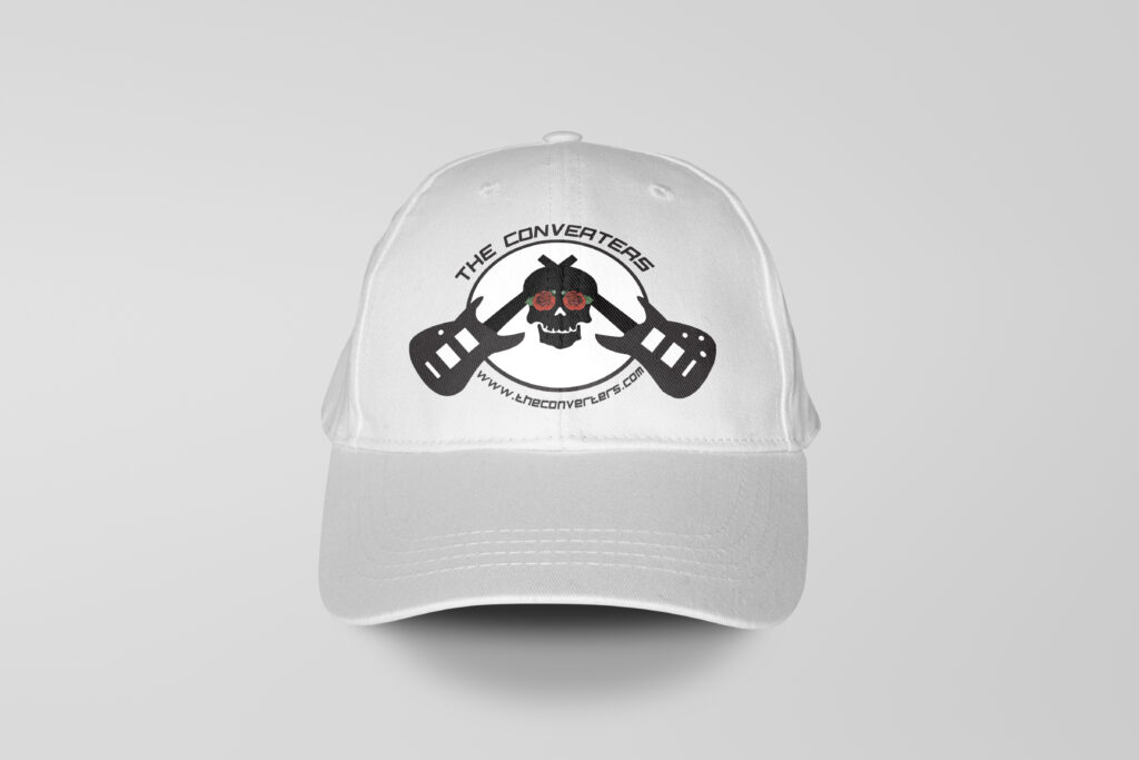
Hat Prototype
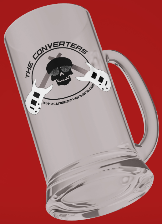
Beer Mug Mockup
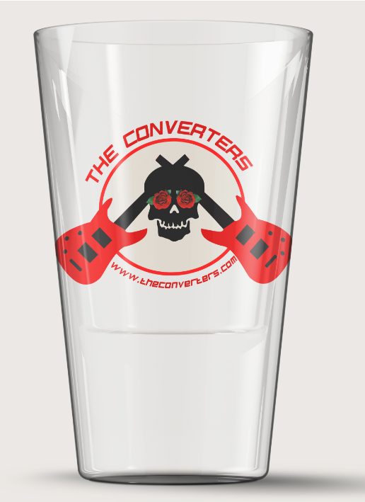
Shot Glass Mockup