Keurig Package Design
As part of our Cafe Tempo case study, our team designed a keurig package for their caramel nut crunch flavor.
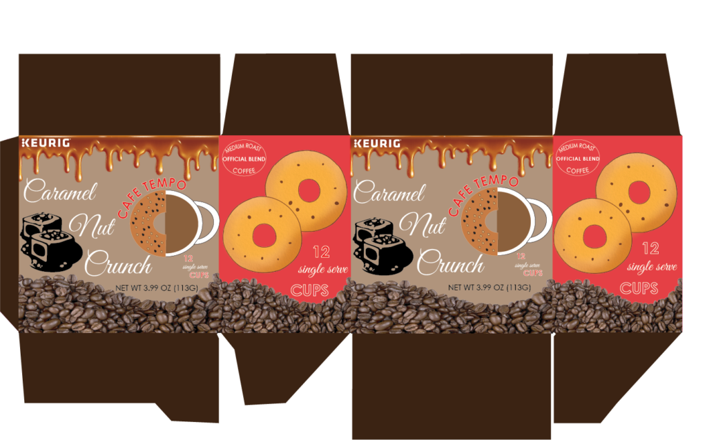
We designed this box in Adobe Illustrator and the design ideas came from our Primo Creatives team.
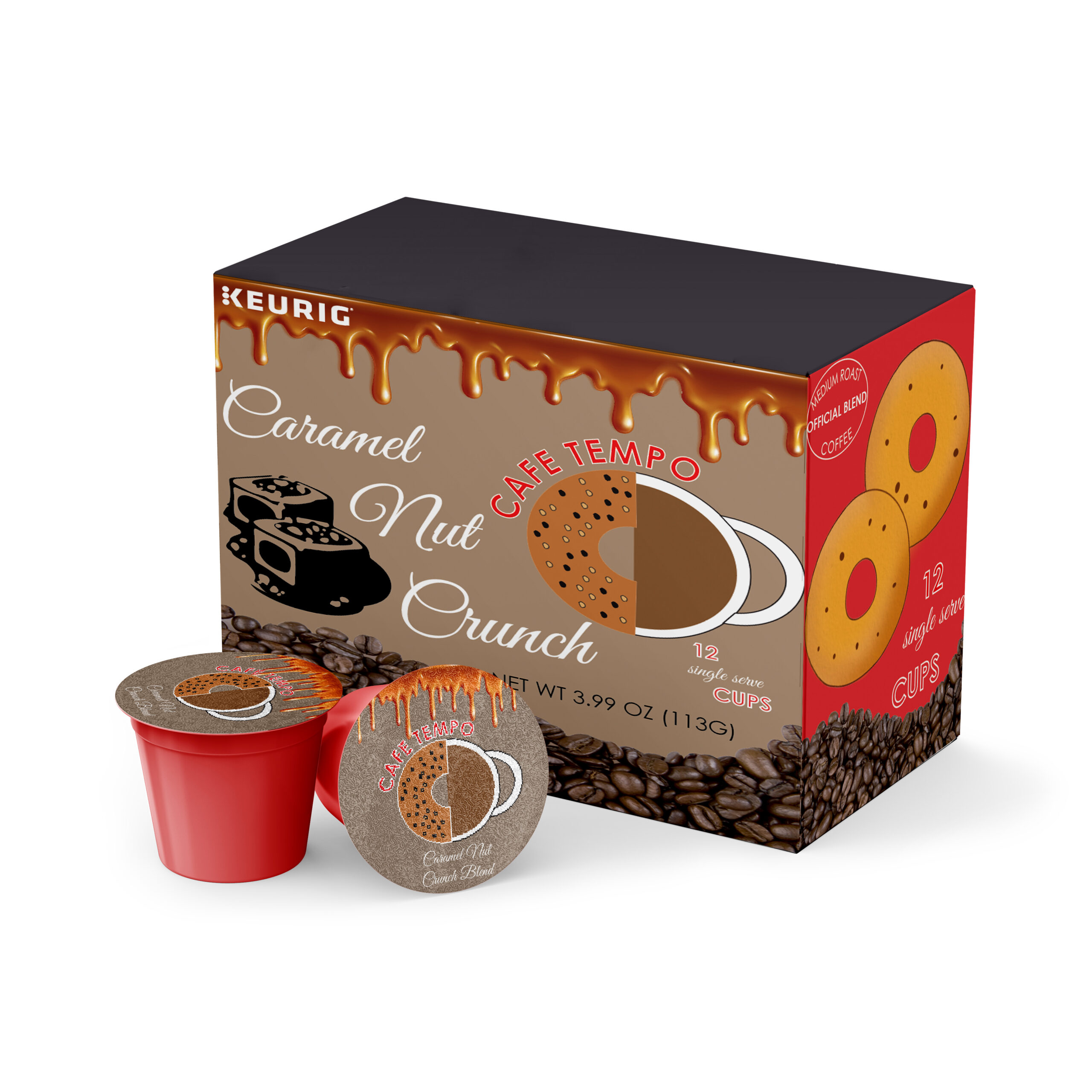
As part of our Cafe Tempo case study, our team designed a keurig package for their caramel nut crunch flavor.

We designed this box in Adobe Illustrator and the design ideas came from our Primo Creatives team.
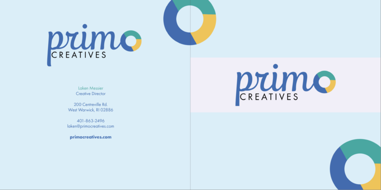
The Branding Book is a project from New England Institute of Technology. This is the front and back cover of our Primo Creatives company book, exhibiting our logo, color palette, and contact info on the back. Our book was created using Adobe InDesign. The objective for the branding book project was to create a 12-page…

Our first brochure was designed for the town of Coventry in our state of Rhode Island. The Primo Creatives Team designed our own logo to represent the town, which is the iconic Nathanael Greene Homestead on a starry night. Our team conducted weeks of research on the town of Coventry and we’ve concluded they are…
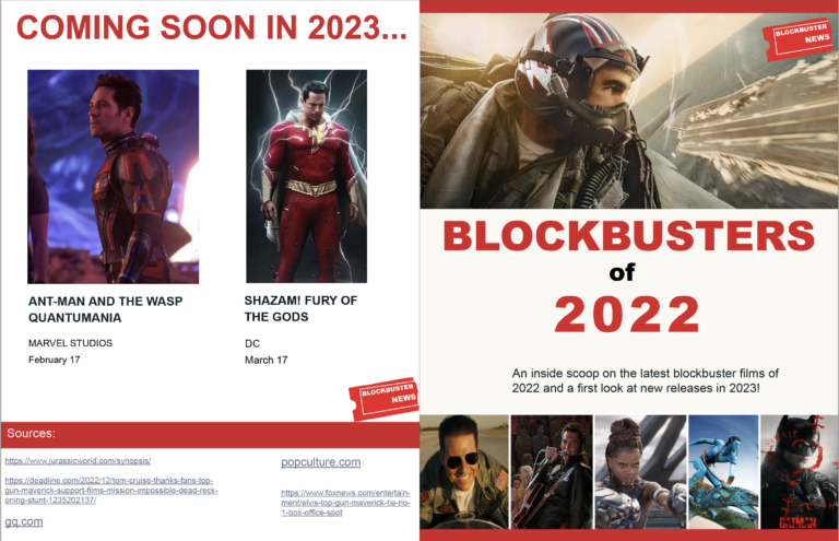
The project objective was to choose a topic and design a 4 page (front & back, 2 interior pages) newsletter on it in Adobe InDesign. This is a newsletter on the biggest blockbuster hits of 2022 designed by Laken Messier at New England Institute of Technology. The front cover contains a hero image, followed by…

This art style is called “photo montage.” The art of a photo montage is taking two or more images and combining them together to create one beautiful image. Photo Montage is a style you can master with any images you feel would combine together very well. We designed this photo montage of a white sailboat…
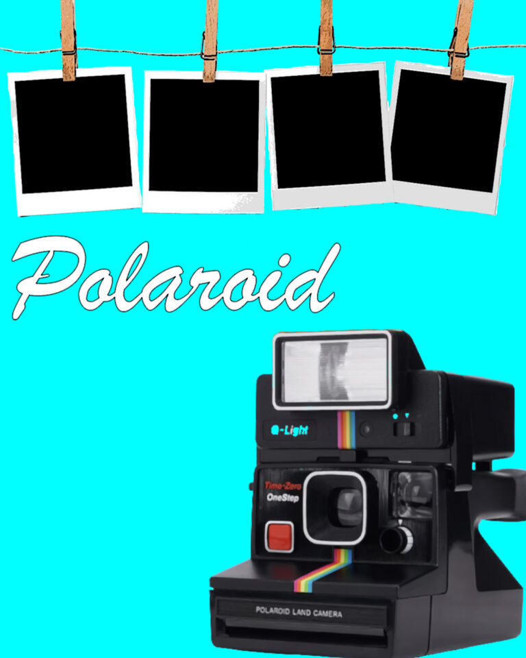
In Plakatstil, the objective is to create a poster demonstrating a unique relationship between image and text. The goal is to leave enough white space on the poster, so that the product and text stand out on their own without too much content getting in the way. We designed a poster for Polaroid. We created…
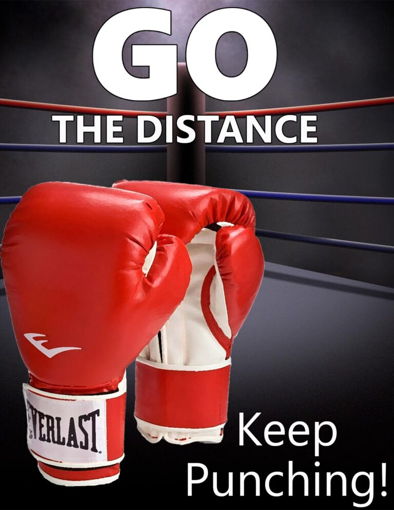
This poster contains two art styles: Propaganda and Plakatstil. We designed an advertisement for Everlast boxing gloves, where we made the boxing gloves a key focal point in the image with just enough white space around them to include text. Our color palette is primarily red, black, and white. The taglines and brand are inspired…