Wayfinding Case Study
For the GMW wayfinding assignment, the goal was to come up with wayfinding signage to
go around areas of the NEIT campus that lead to the GMW suite. The overall mission is to
help new students and visitors find their way around the building to the GMW suite
without getting lost. As part of the assignment, we designed logos for the GMW program,
making sure the logos contained pictograms showing the classes we offer in the program.
We also created our own pictograms for the five main subjects taught in GMW that can be
displayed on kiosks and signage, promoting the program. In the end, we each created a
PowerPoint presentation, containing pictures taken around the campus. The pictures
showcase different entrances and hallways of the building, leading up to the GMW suite.
After examining the wayfinding structure around the school, we designed composites over
the images of signage we believe would better help newcomers around the school and to
GMW. Along with the signage, we created kiosks for the main entry way, listing all of the
departments and the floors they are on. We also added our pictograms and new logos
around the GMW department to show what we offer and to not let any student, parent, or
visitor feel lost when they enter the building for the first time. We want to be certain that
everyone can find their way with no problems.
Section 1: Company We’re Designing For
Graphics, Multimedia, & Web Design college program at the New England Institute of
Technology in East Greenwich, Rhode Island.
The customers are new students enrolling for the GMW program, parents attending open
house for their kids ready to enroll, and visitors coming in to speak with a class, or check
out the program.
Section 2: Their Challenge
The challenge new students and visitors might experience is getting lost around the building and
not being able to find where they need to be. This could cause many people to feel anxious
because they’re so unfamiliar with the place. Also, some might feel embarrassed to ask someone
for directions, especially considering they don’t know anybody there. The result of somebody
getting lost could turn out badly in the case of the individual not wanting to go back or giving the place a negative report for not having enough signage or not enough help getting around.
How I Approached This Challenge
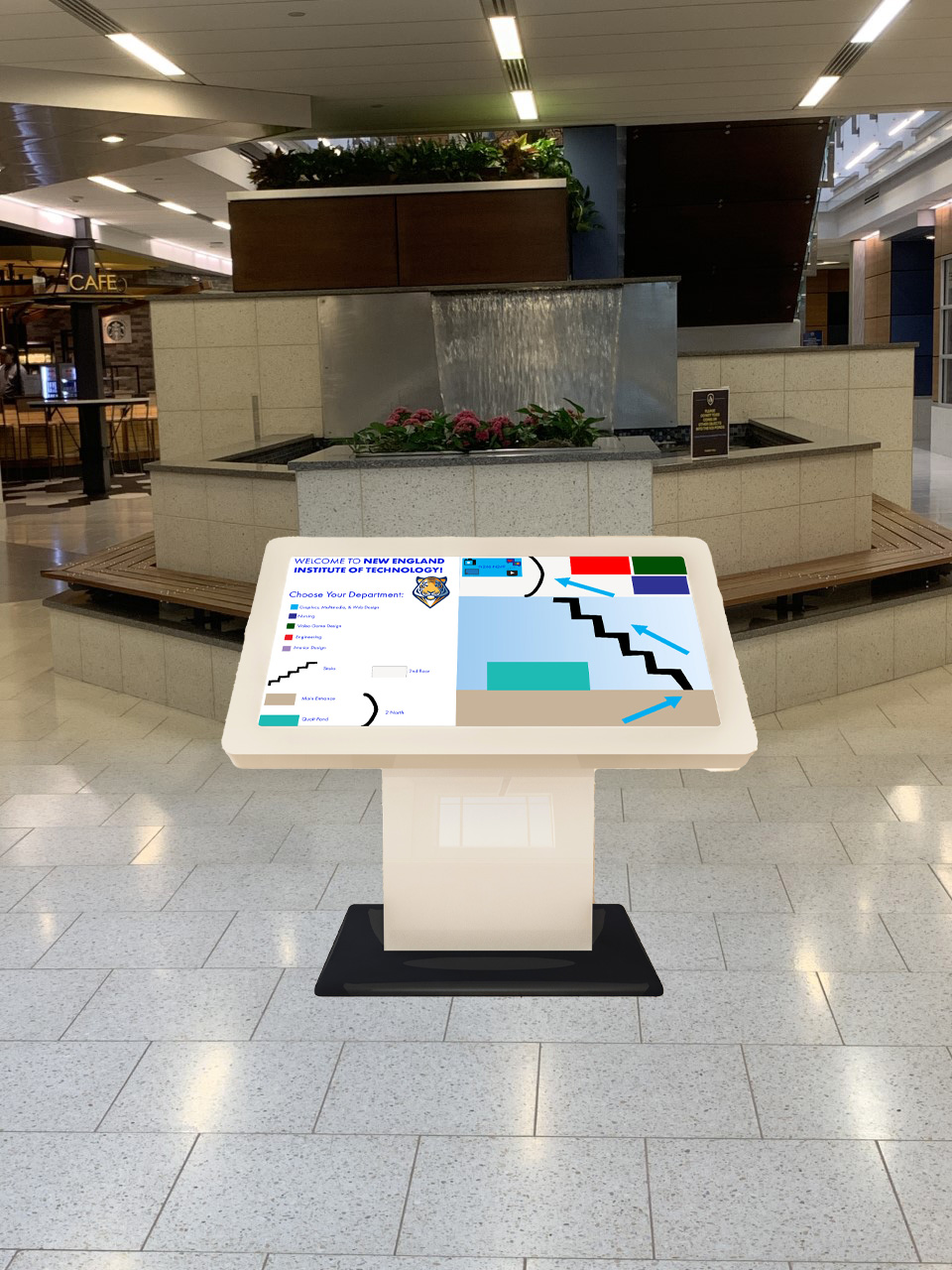
The way I approached the challenge was based on my personal perception. I put myself in the shoes of a new student or a first-time visitor as I was designing the kiosk. I updated my kiosk design, so that each department was color coded and users can click on one of the colored boxes if they need help finding directions to a certain department. When they click on a department, a map will appear on the other side of the screen showing them how to get there from the main entrance of the building. Arrows in the department color will appear, directing users to the wing of their department. There will also be icons displayed where the department is located, as well as room numbers.
Timeline
It took a couple of weeks to get all of my ideas together and plan everything out. The design process took several days to get everything looking good and how I wanted it. The hardest part was developing my ideas as I wanted to make sure the kiosk would be helpful enough to first time visitors. This project required a lot of research and thinking. There are many different wayfinding techniques to display, but only certain ones will be effective to users. That is what I learned from this experience.